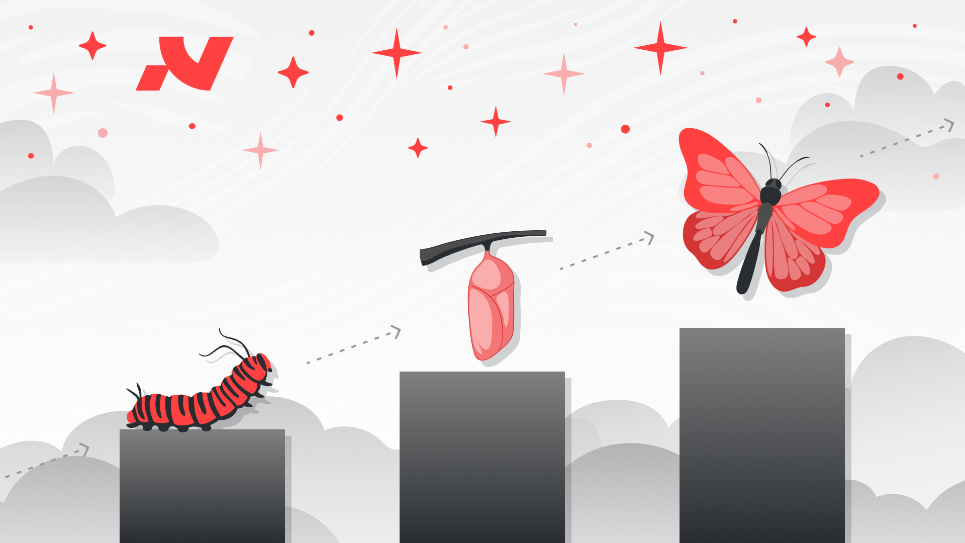
Make Complex Simple
.avif)
(A Love Letter to Designers Who’ve Forgotten What Design Is)
I’m going to go on a tangent. A spicy one.
Agree, disagree, fight me in the comments - doesn’t matter.
This one’s been simmering for too long and it’s finally time to blow the lid off.
Let’s start here:
Function over form.
It’s a foundational UX principle. You’ve heard it before. You probably nodded along to it in some UX bootcamp video narrated by a guy with square glasses and a monotone voice.
But here’s the twist:
Nobody’s actually doing it.
Junior designers especially - bless their pastel gradients and brutalist grids - love pretty things. Their portfolios are dripping with glassmorphism, parallax scrolls, and typefaces that look like they’ve been plucked off a Berlin gallery wall.
And you know what?
It looks great.
Until you try to actually use it.
And then suddenly you're stuck in an over-animated hellscape, with a navigation menu that’s more confusing than IKEA instructions translated into Morse code.
This is where art and design part ways.
Art is emotional.
Design is functional.
Design is something you interact with. It has a goal. A job. A purpose. And that purpose isn’t to flex how many interactions you can cram into a hero section. It’s to get the damn user from A to B with minimal friction.
Isoflow Got It Right
There’s this UX/UI agency down here in ZA called Isoflow.
Their slogan?
“Make Complex Simple.”
That’s it. That’s the post.
It’s the most beautifully distilled version of what design should be.
Strip back the noise.
Tame the chaos.
Turn “WTF is this?” into “Oh, that makes sense.”
And yet… somehow, in 2025, this basic principle has been shoved aside in favour of gimmicks and gimmick awards.
Cue: Awwwards - The Clown Car of Subjectivity
Let’s talk about the popular design site Awwwards.
Great source for visual inspo, sure. But go look at how they judge sites:
- Design: 40%
- Usability: 30%
- Creativity: 20%
- Content: 10%
You read that right.
Content - the thing that actually communicates the message - only counts 10%.
You know, the thing that converts visitors into buyers. The thing that explains what the company does. The thing that lets users understand if they’re in the right place?
Yeah, that.
Flash over function, baby. We’re in *aesthetic* hell.
Look, I get it… not every site is selling B2B SaaS.
Some are for movies. Music. Art installations. Experimental stuff.
Cool. Go wild.
But the problem is, even agency websites (you know, the ones pitching to businesses) are doing backflips on scroll.
I’ve left sites thinking, “That was cool…”
Then I pause and realise:
I have no clue what they even do.
Design for Outcomes, Not Applause
Design should feel effortless.
Not because it’s basic, but because the thought behind it was so damn intentional.
Creativity isn’t just about being clever.
It’s about being clear.
Yes, make it beautiful.
But beauty is meaningless if it doesn’t work.
You know what actually impresses me?
- A website that converts.
- A flow that’s intuitive enough my mom could use it.
- A layout that scales across devices without breaking into tears.
We don’t need louder design.
We need smarter design.
Intent Is the Real Differentiator
The best Creative Directors I’ve worked with?
They don’t push pixels for fun.
They build with intent.
They balance the sexy with the smart.
They know when to go minimal and when to go full Figma-porn.
They ask:
- Who is this for?
- What’s the goal?
- What problem are we solving?
Untargeted creativity is just noise.
Intentful design? That’s power.
Final Thought: Be Better Than Pretty
Next time you're designing a site, ask yourself:
- Does this solve a real problem?
- Is the experience frictionless?
- Can a total stranger land here and understand what’s going on in five seconds?
If not… back to the drawing board.
Design isn’t a visual stunt show.
It’s a craft. A discipline.
And the best designs?
They make the complex look effortless.